Venory - a digital municipality
Venory is a digital platform designed to help municipalities navigate complex decisions around services, funding, infrastructure and implementation. The core challenge was not a lack of information, but the opposite: fragmented sources, limited time, high responsibility and too many unclear next steps.
The task was to translate this complexity into a clear, trustworthy and scalable product experience — from brand strategy and naming to logo, visual identity, UI system, assistant logic, image language and contextual chat experiences.
01 Context
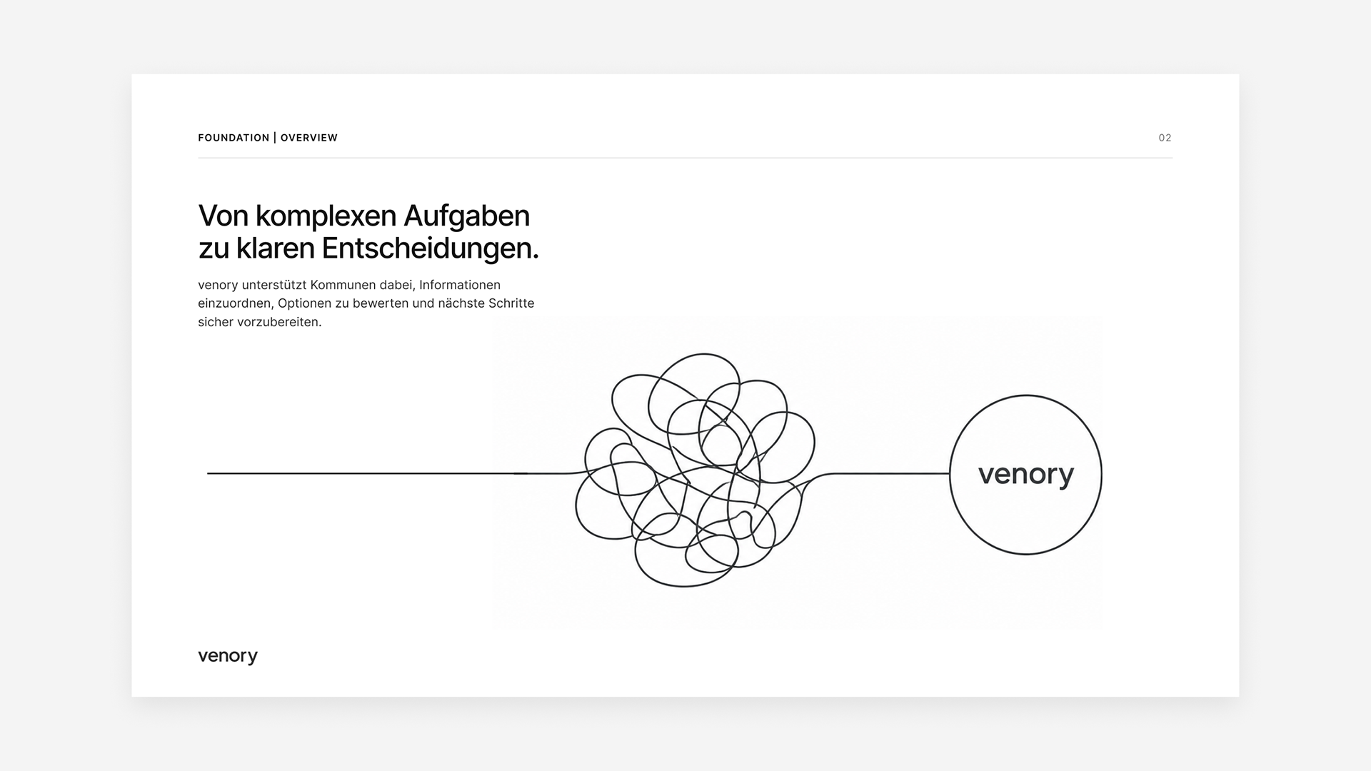
Why municipalities need orientationMunicipalities have to evaluate complex topics such as funding, infrastructure, climate action and digital services — often under time pressure and with limited resources. The task was to translate this fragmented reality into a clear product and brand logic. Venory was designed not to add more information, but to create orientation.
02 Strategy
Guided decisions instead of information overload
The strategic idea was simple: guided decisions instead of information overload. Based on this principle, a system was developed that structures options, explains connections and leads users step by step towards the next relevant action. This logic shaped the brand, UX, UI, chat experience and tone of voice.
03 Brand Identity
Name, logo, tone of voice, typography, color
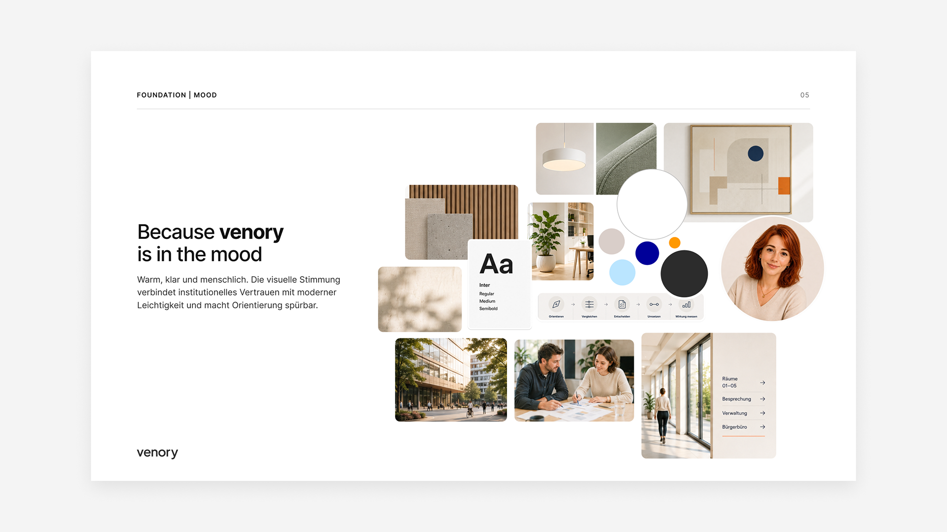
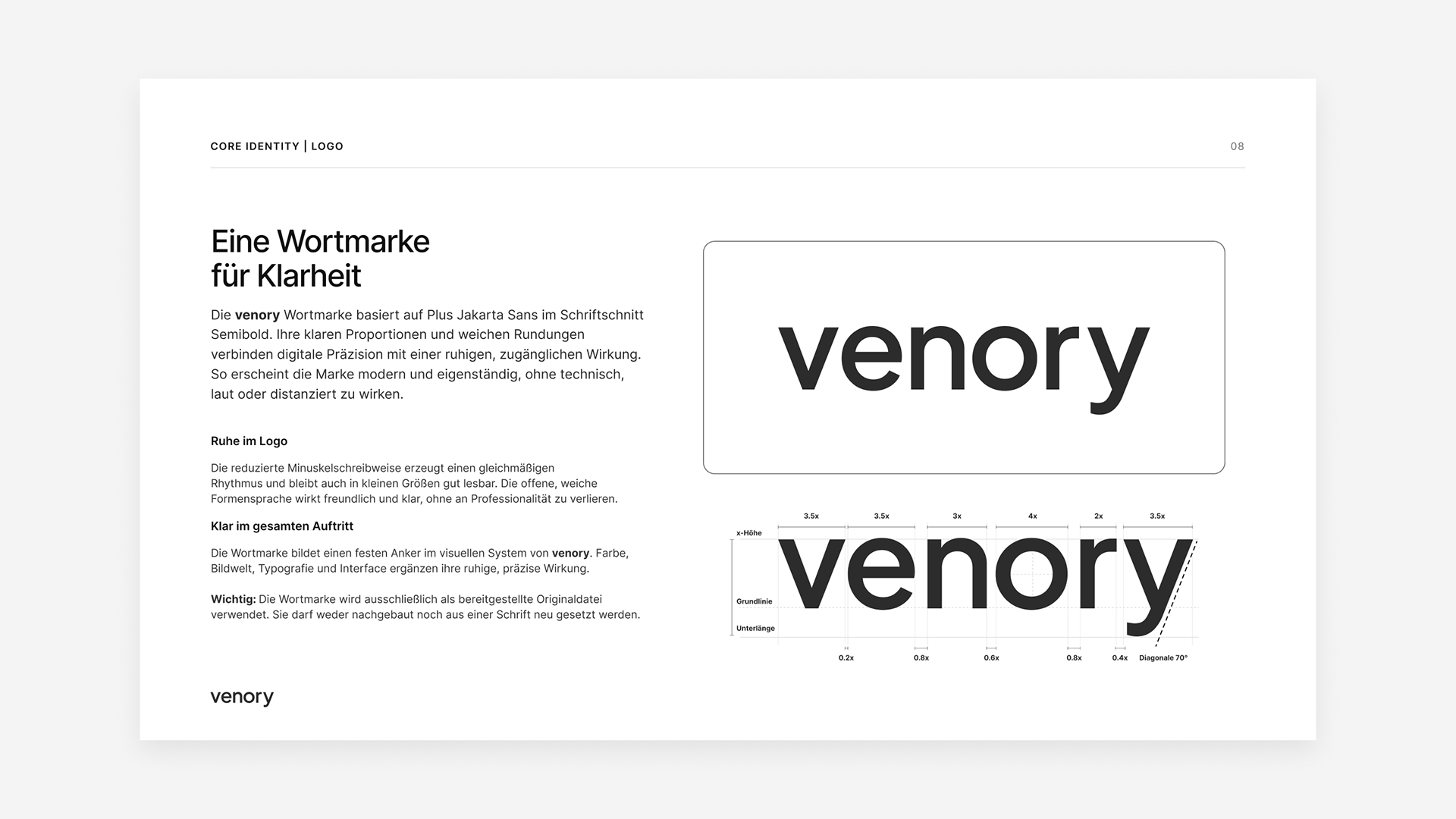
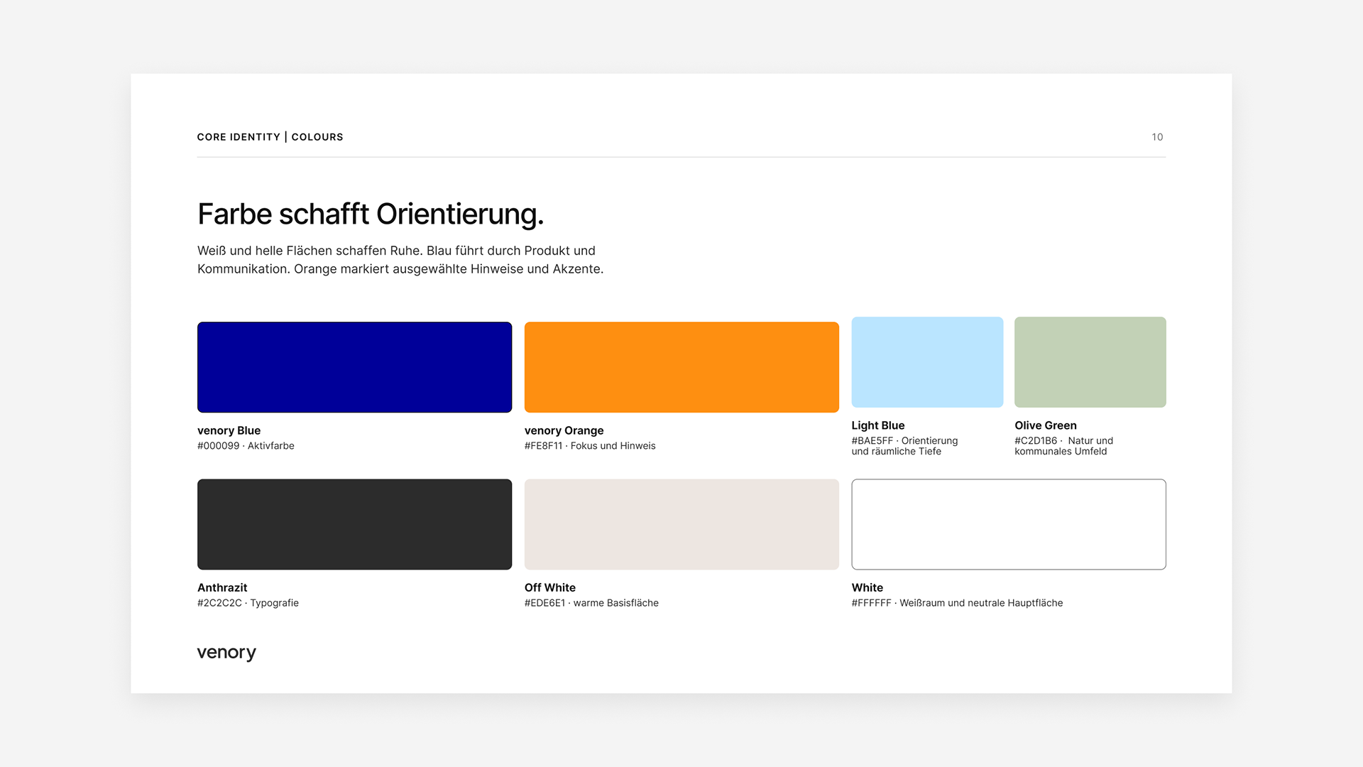
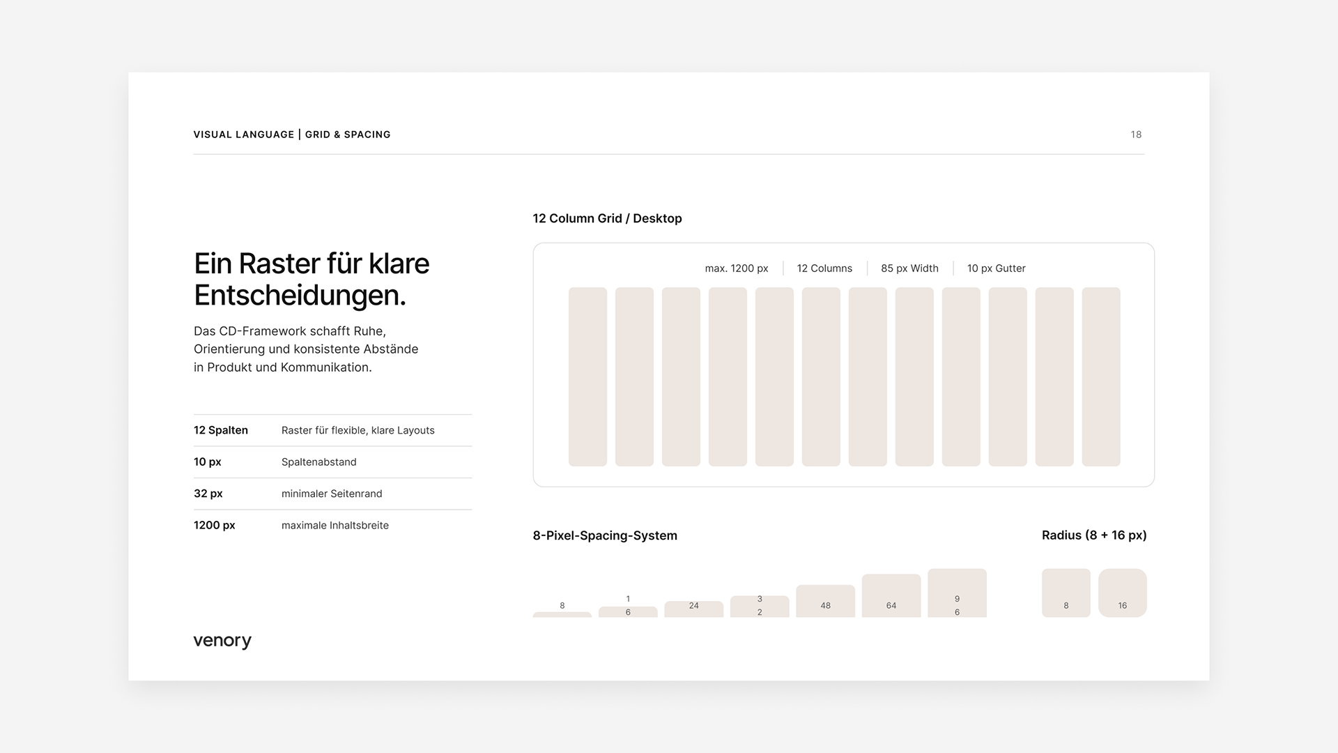
The brand was designed to feel modern, trustworthy and calm — clearly digital, but never loud or playful. Name, logo, typography and color system follow a reduced visual logic that communicates precision and orientation. Blue acts as the stable primary color, while orange creates focused moments of attention.
04 Product Experience
UX principles, dashboard, map, decision flows
The product experience was built around one central question: what helps users move forward right now? Dashboard, map and decision flows were structured to bundle relevant information and make next steps visible. Clear hierarchies, modular cards and guided interactions reduce complexity.
05 AI & Contextual Chat
Embedding the assistant without letting it take over the brand
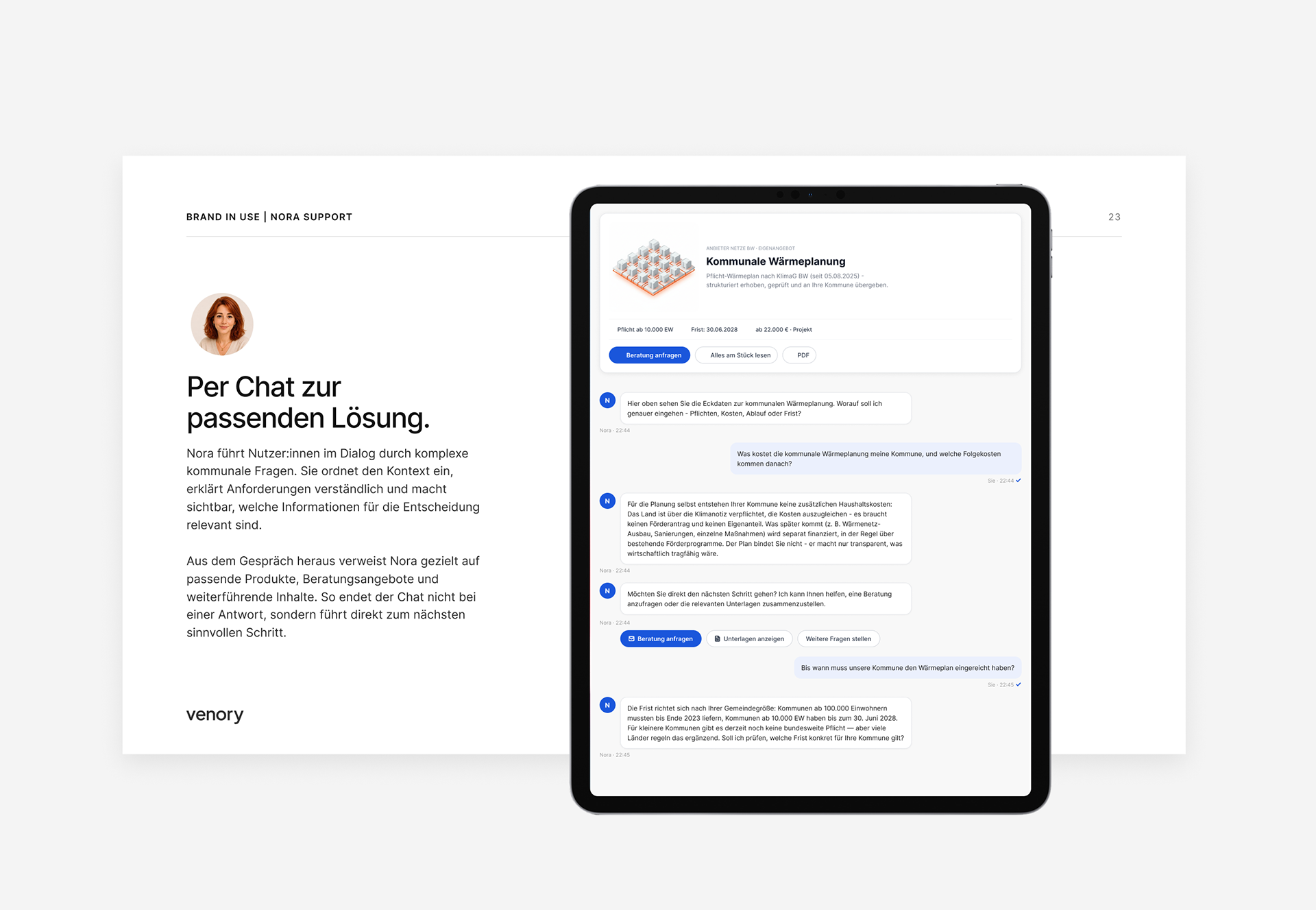
The AI assistant was designed as contextual support, not as the main brand promise. It helps where users need orientation: within maps, funding topics, project information or decision processes. This keeps Venory a platform for municipal tasks — with AI as a helpful layer in the background.
06 Character & Image Language
Nora, municipal imagery, no stock or AI clichés
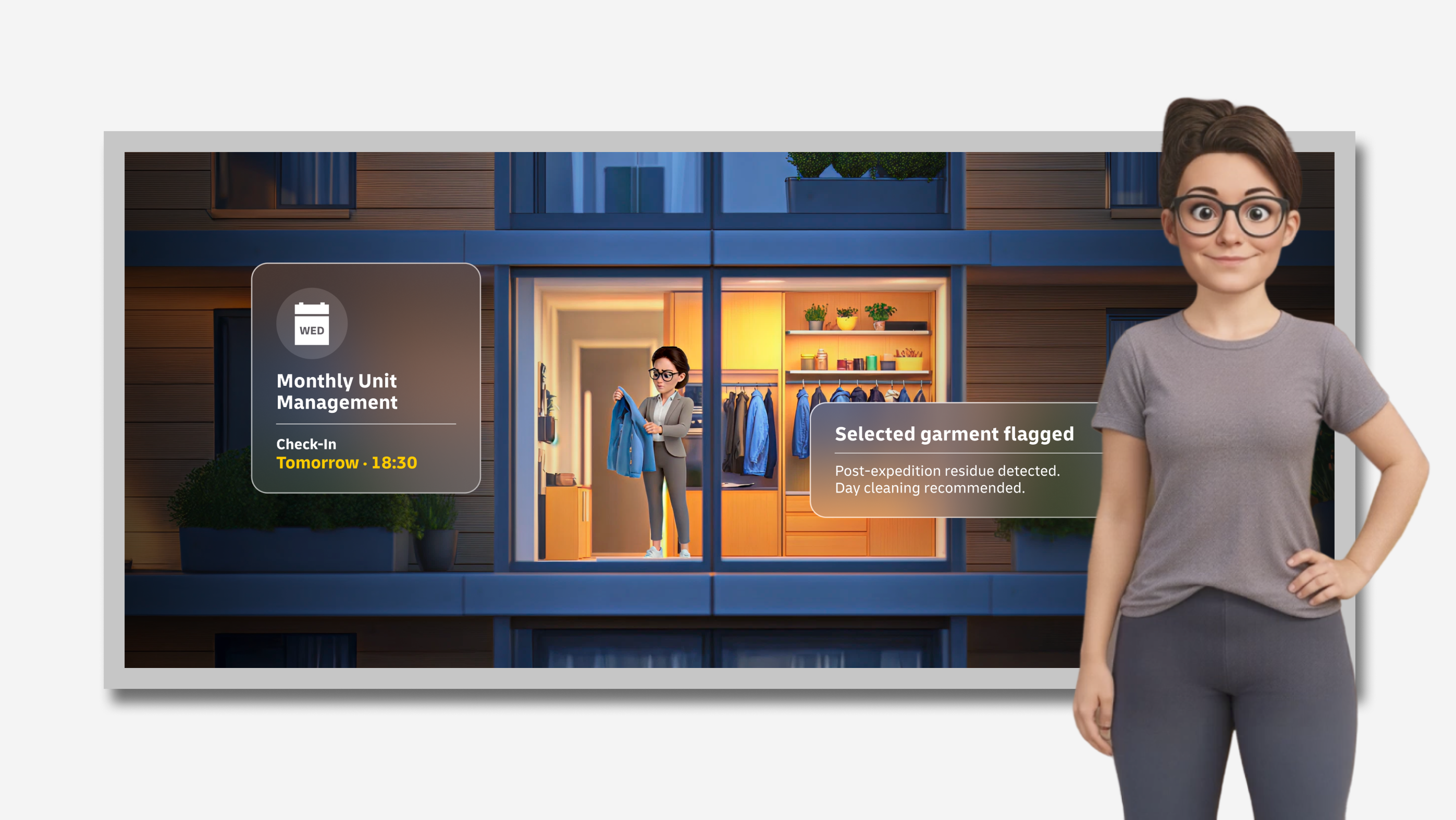
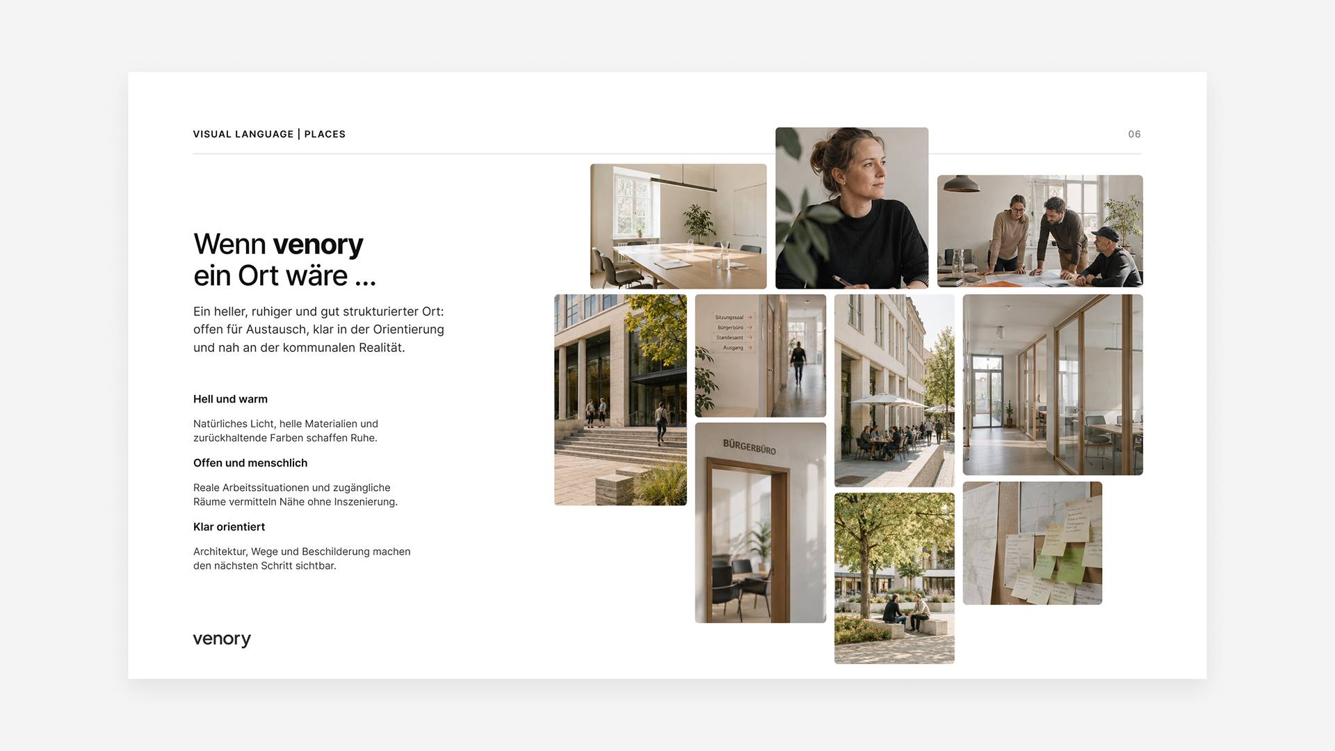
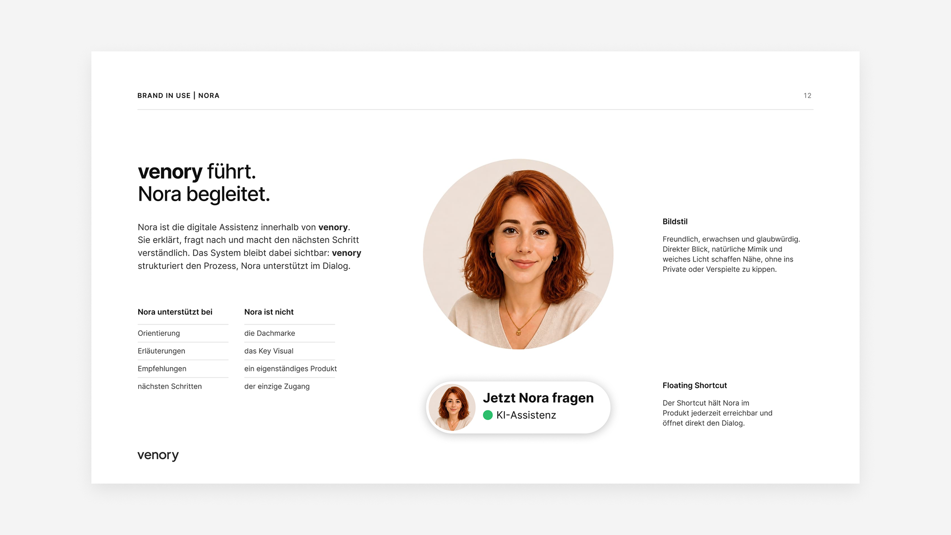
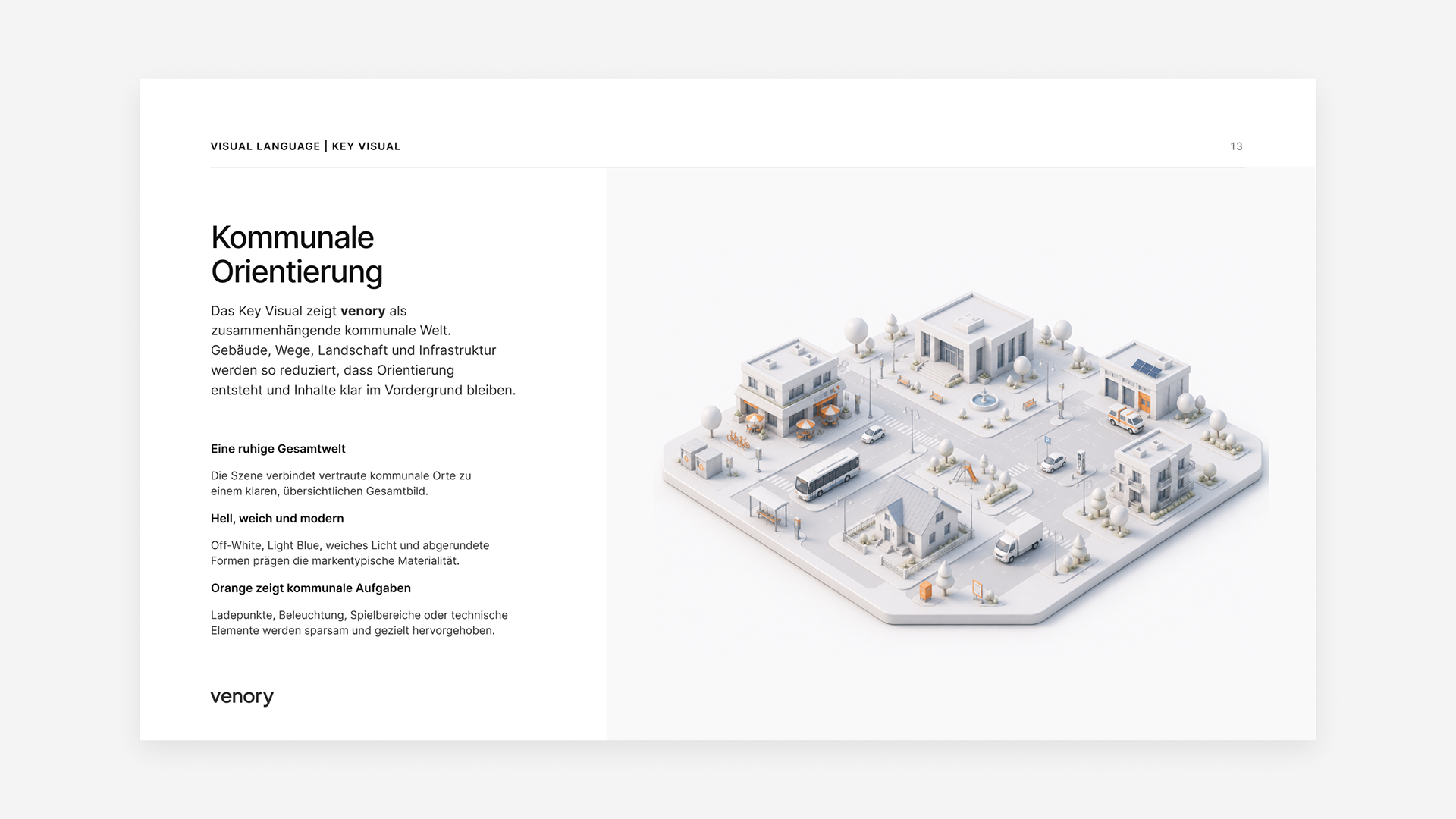
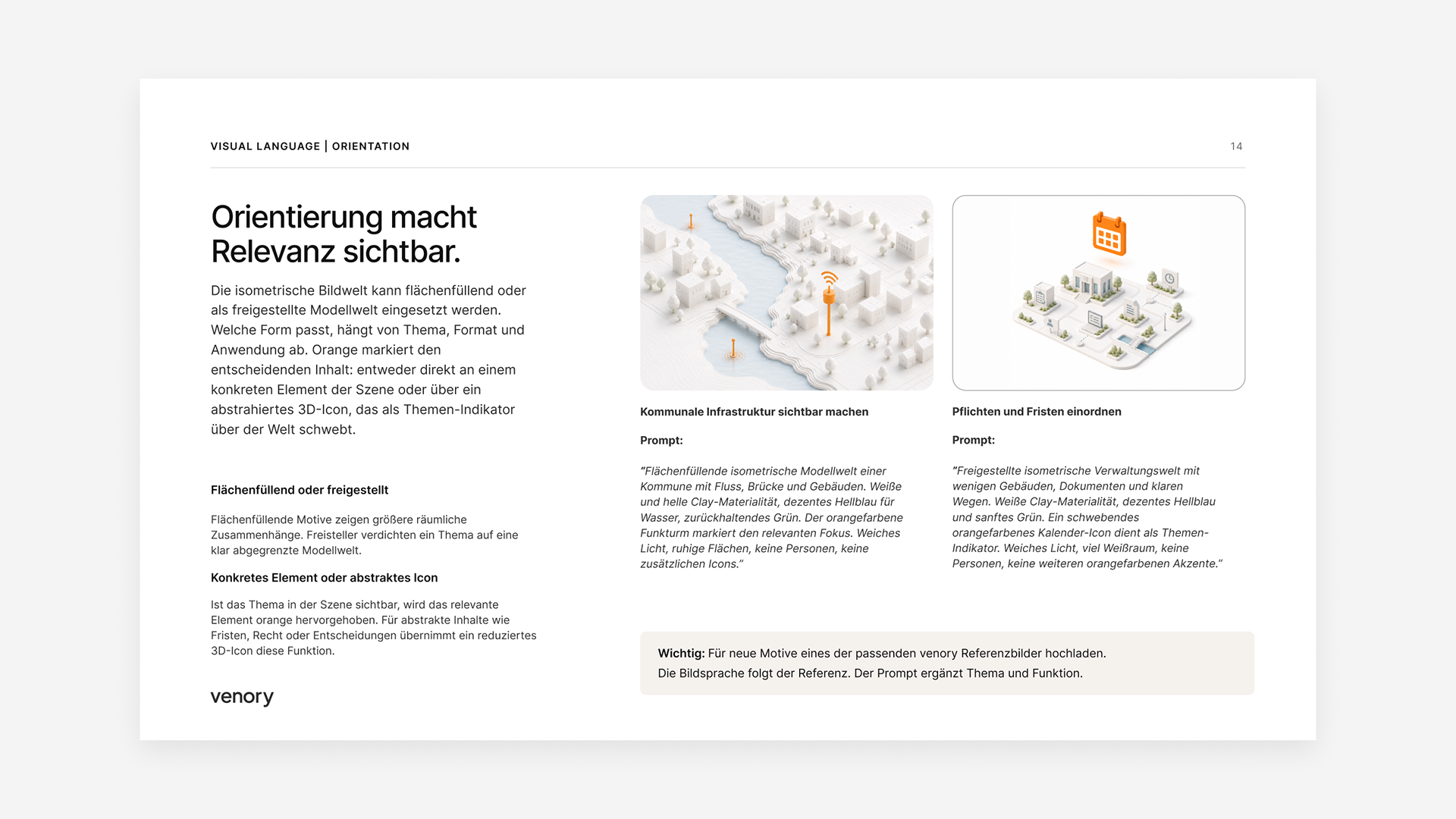
Nora was developed with a deliberately restrained role: she guides, explains and supports without becoming a mascot. The image language moves away from generic stock visuals and exaggerated AI aesthetics. Instead, it focuses on municipal spaces, infrastructure, collaboration and real-world use cases.
07 System & Applications
UI components, mobile screens, brand guide, applications
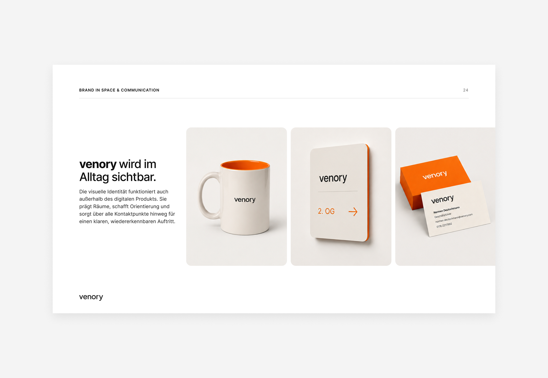
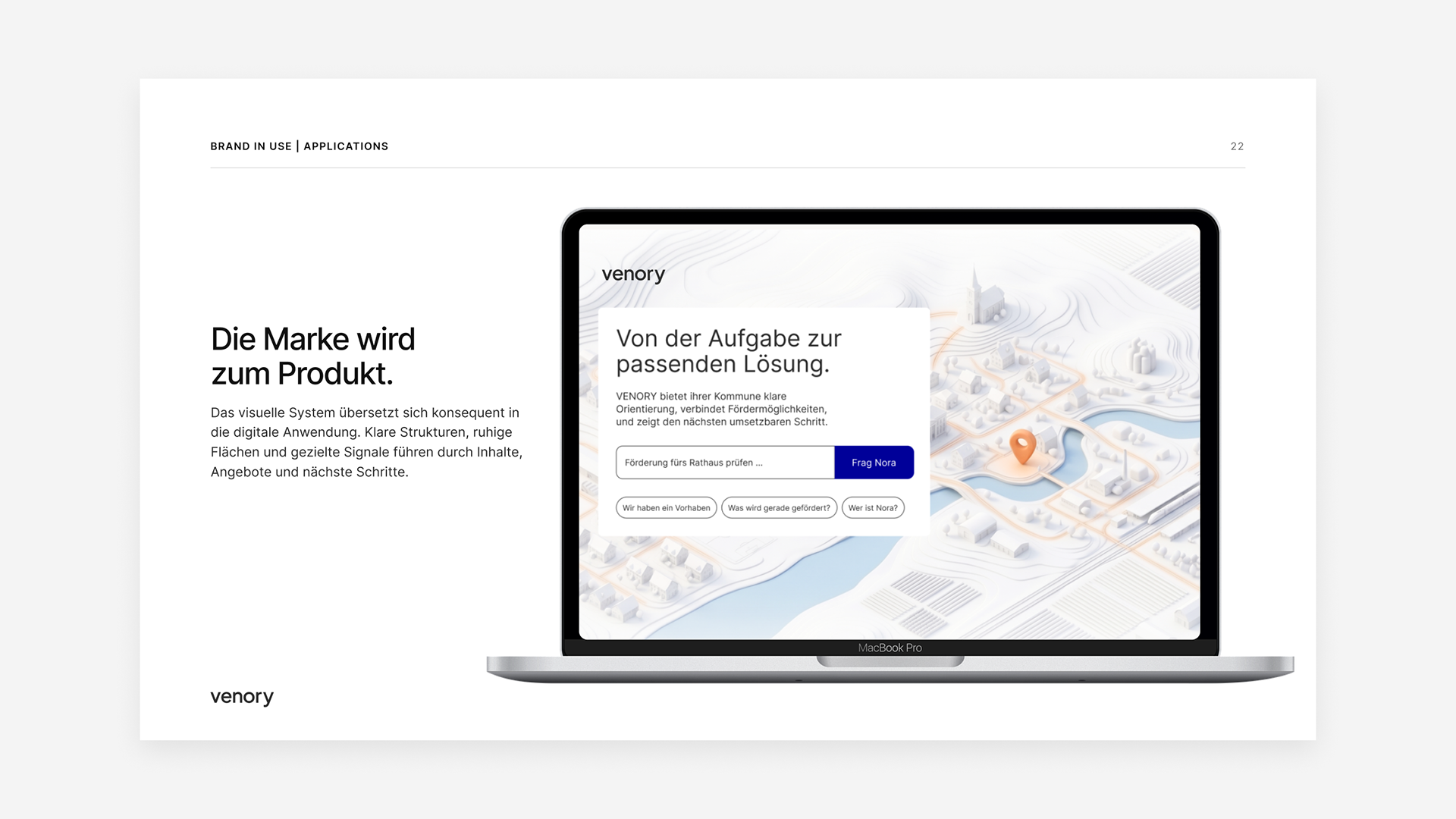
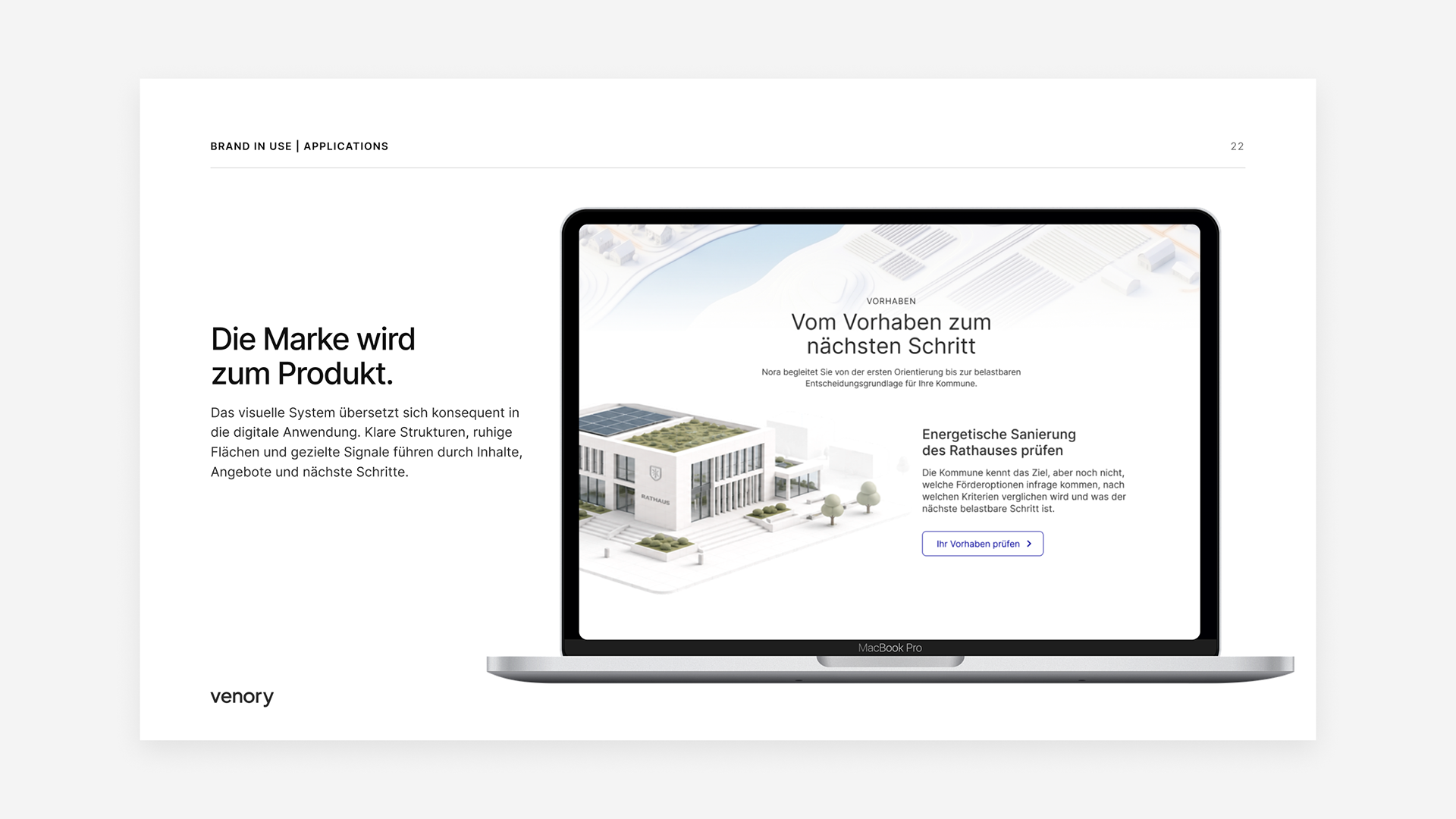
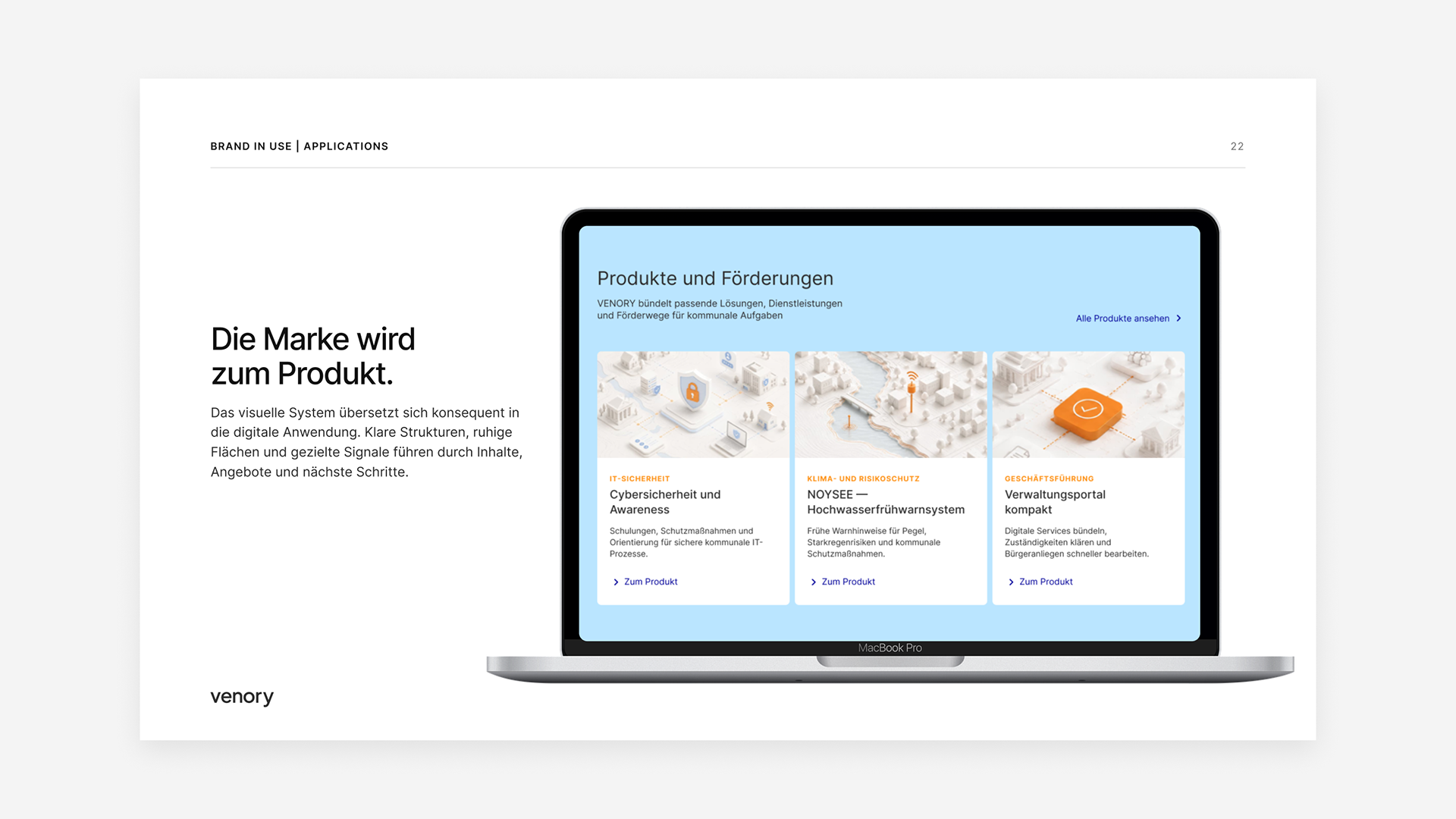
The design system connects brand, interface and applications into one consistent experience. Components such as buttons, cards, forms, filters, status indicators and chat modules follow the same logic. This allows Venory to scale across desktop, mobile, brand guide and communication materials.
08 Result
A scalable brand and product system for municipal decisions
The result is a complete brand and product system for municipal orientation. Branding, UX/UI, AI interaction, character design, image language and design system work together as one coherent platform idea. Venory makes complex municipal decisions more accessible, structured and action-oriented.