My Porsche Charging App | Porsche AG
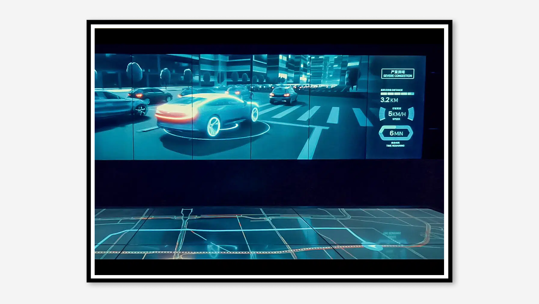
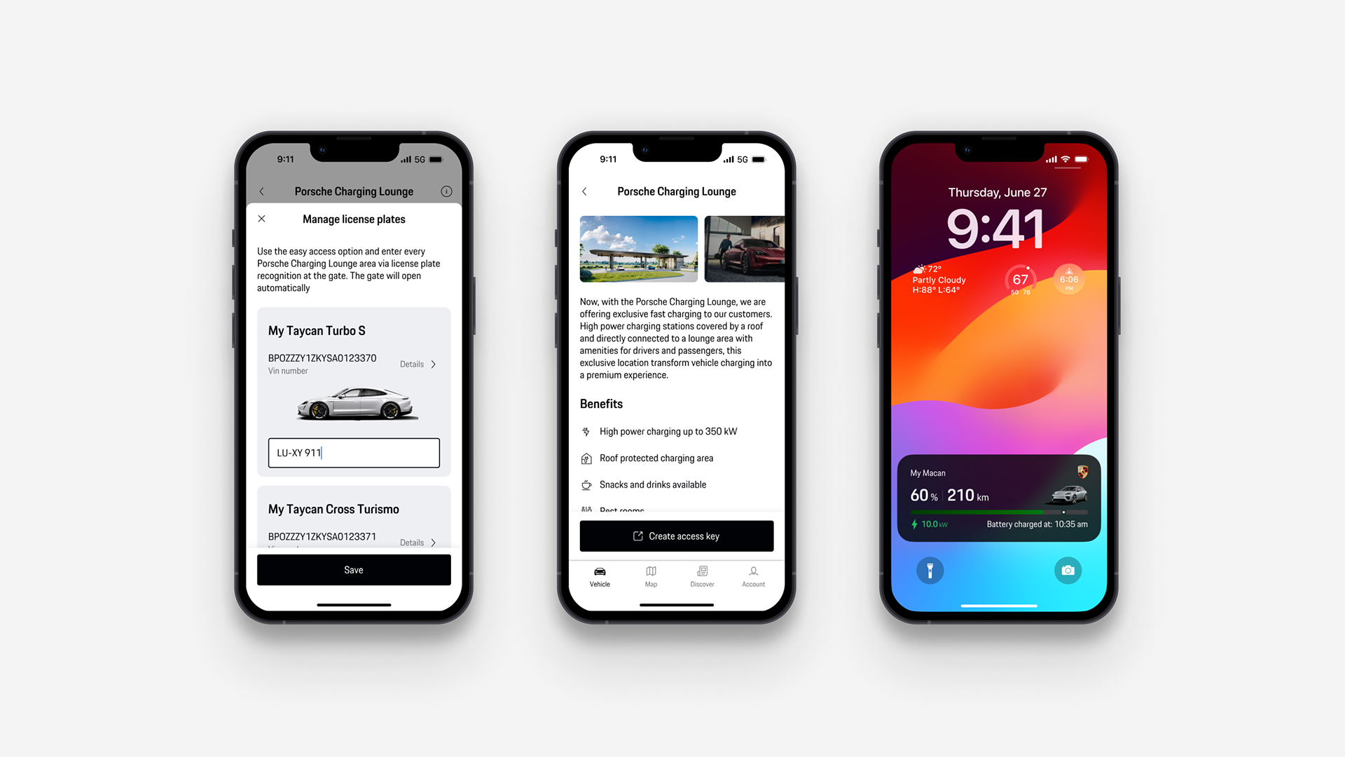
The Porsche Charging App faced significant usability issues, with owners struggling to find stations, initiate charging, and track history. As on of the UX/UI Designers on our team, I led interface solutions while collaborating on research. We designed an intuitive information architecture, created visual filtering for station availability, simplified authentication to a single scan, and developed an insightful charging dashboard. Our redesign improved ratings, reduced abandonment rates, and increased adoption.

Through detailed UX research with Taycan owners and competitive analysis, I redesigned the interface with a focus on visual clarity and simplicity. My UI solutions included an intuitive visual hierarchy for core functions, a map-based filtering system with color-coded availability indicators, a streamlined single-scan authentication interface replacing multiple interactions, and a dashboard with data visualizations for charging metrics and energy consumption
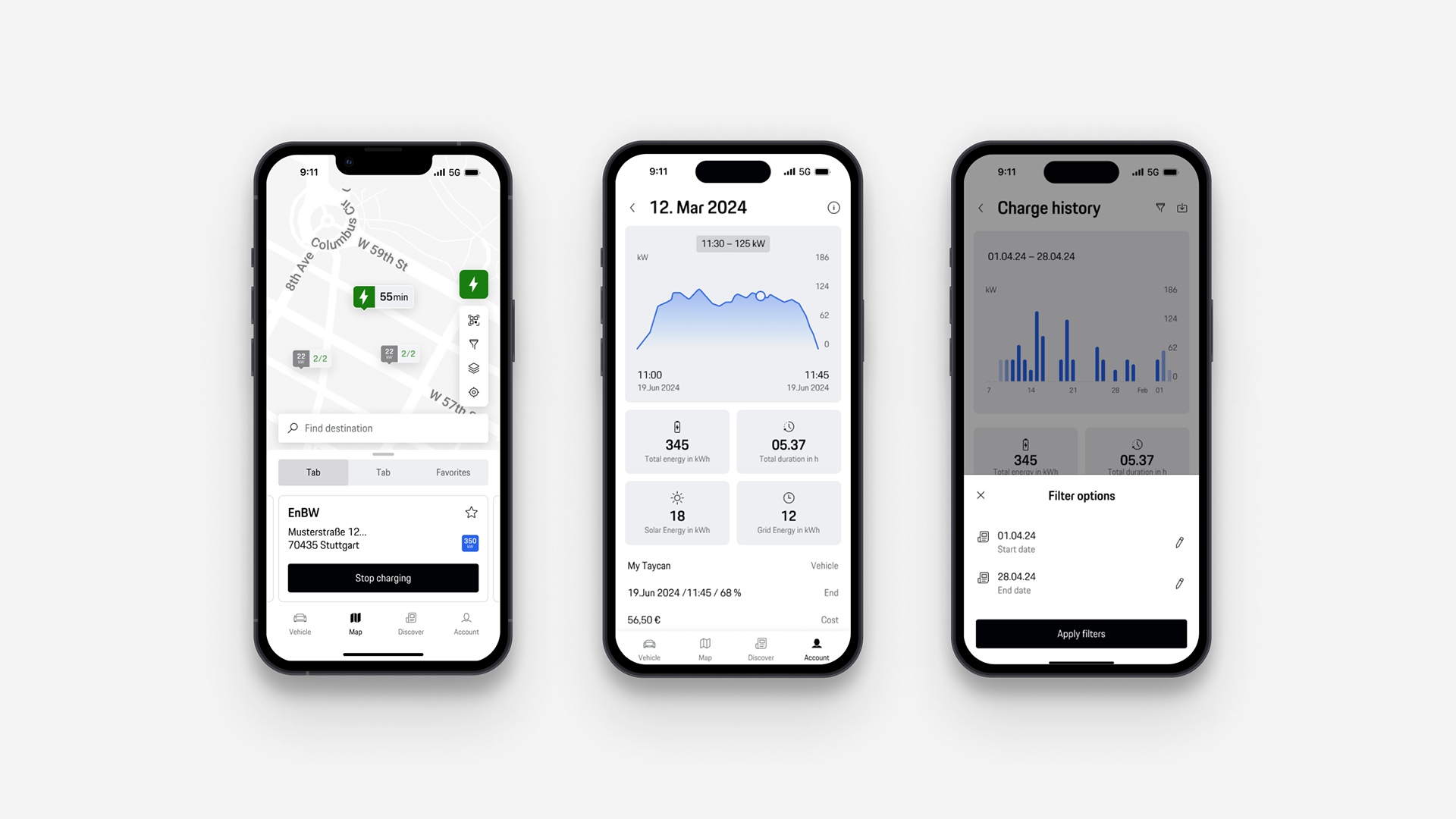
Drawing from research insights, I focused on visual UI solutions for the My Porsche Charging App. I designed an intuitive navigation system with clear visual hierarchy, created a map interface with color-coded station indicators, developed a minimalist single-scan authentication screen, and crafted a dashboard with elegant data visualizations for charging metrics
Our UI redesign of the My Porsche Charging App delivered measurable results: substantially improved App Store ratings, reduced search abandonment rates, faster charging initiation through visual simplification, and growing user adoption. The visual design system and interface patterns established in this project have since been adopted across Porsche Digital's product range.